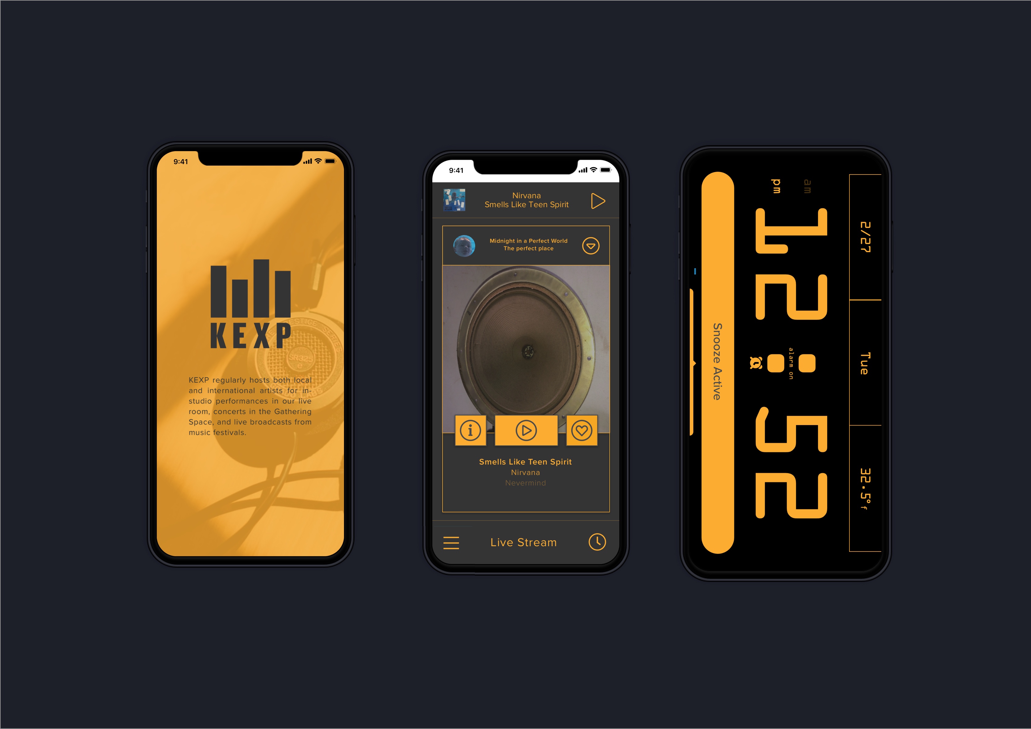
KEXP App
KEXP App Clock Radio Feature—Study
UI / Visual Design for Mobile Apps — Winter 2019 SVC Seattle
Project Statement:
KEXP is a nonprofit arts organization operating one of the most influential listener-supported radio stations in the world, 90.3 KEXP-FM Seattle, reaching over 200,000 listeners on-line and on-air each week.
The project was for the UI/Visual Design for Mobile Apps class at the School of Visual Concepts Seattle. The task was to add additional features/redesign the KEXP mobile application. The mobile app in its current form was a very basic limited feature streaming player app. By adding additional features to the app, we could increase the functionality of the app and user buy-in and utilization.
On this project, I conducted user research to find the streaming app’s pain points. I developed a possible rebrand option for the app and conducted research on possible additional features to add to the app.
- Title: KEXP App Clock Radio Feature
- Designer John Owens
- Date: Summer 2019
- Software: Sketch, InVision, Adobe Photoshop, Adobe illustrator.
Preferably, when starting a mobile app redesign, I like to try out the app before reading the creative brief or discussing the project with the client and note my initial impressions of the app. With this in mind, I proceeded with my research:
Research steps taken:
- Downloaded/used the KEXP app throughout the development process
- Read all app reviews in the App store
- Designed and conducted a web survey on streaming services and the KEXP App
- Conducted in person and phone interviews
- Searched the Internet for news articles, reviews of KEXP and the App
- Researched competing apps/services: Pandora, Slacker Radio, Amazon Music, NPR One, iHeart Radio
Interview / Survey Summary:
World-wide KEXP listeners are self-directed and desire seek out new music experiences. They like to share their new discoveries, favorite songs and artists. They tend to listen to use of radio app as well as a music app and prefer to use their personal mobile device for this purpose.
The interview and survey results showed that users were using apps like Apple Music, Spotify, Pandora. 60% of the users were between the ages of 45-64 with 2 out of 3 users being female. 40% of listeners tune in to the radio on an analog device in addition to using a digital app and preferred the use of the app over a traditional radio. In the past 7 days, all subjects interviewed/surveyed, listened to the radio for 1-1.5 hours. From this research, two scenarios were developed.
The Problem
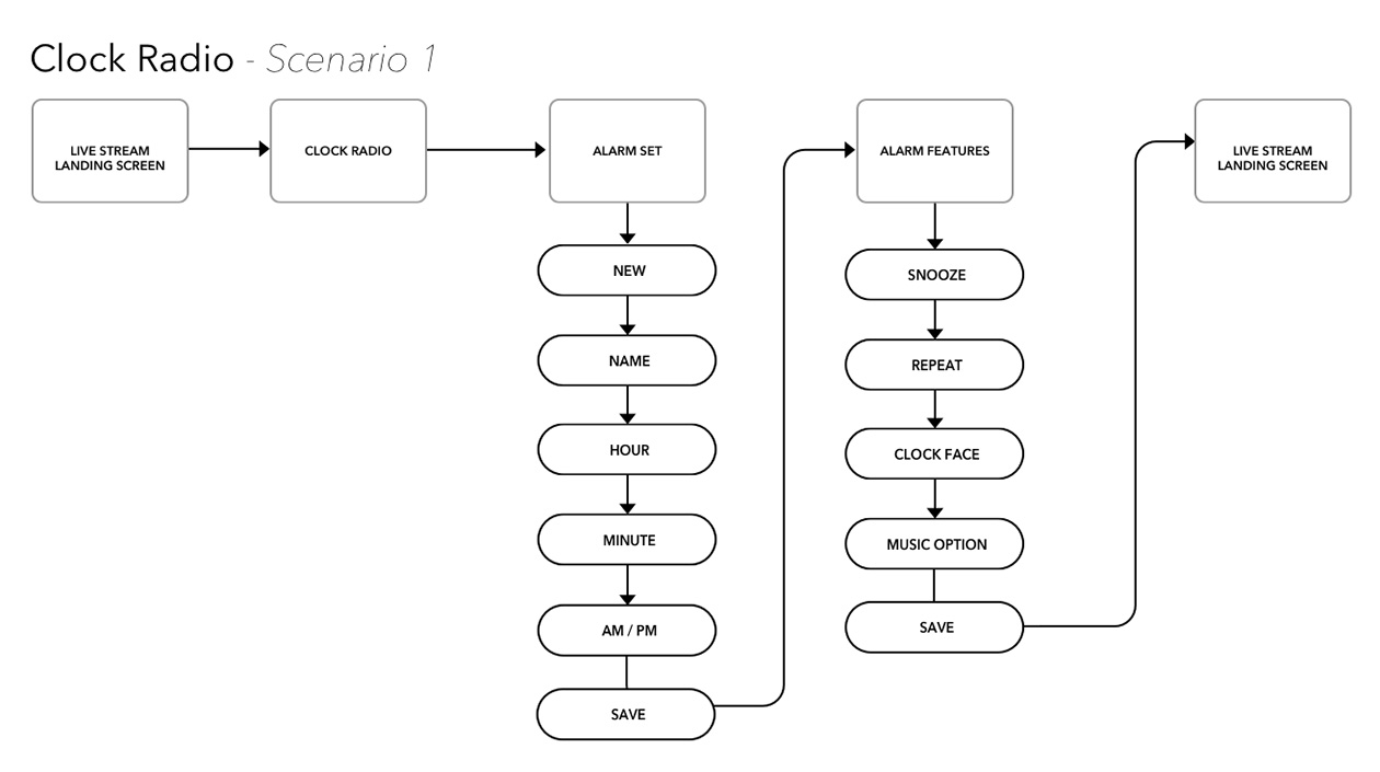
SCENARIO # 1
As a user of the KEXP mobile app, I know what I want to listen to and want to wake up listening to what inspires me in my limited time in the morning.
SCENARIO # 2
(Sound quality was most common complaint in reviews)
As a listener using KEXP mobile app, I want to be able to adjust the sound quality of the music since the listening experience is important to me.
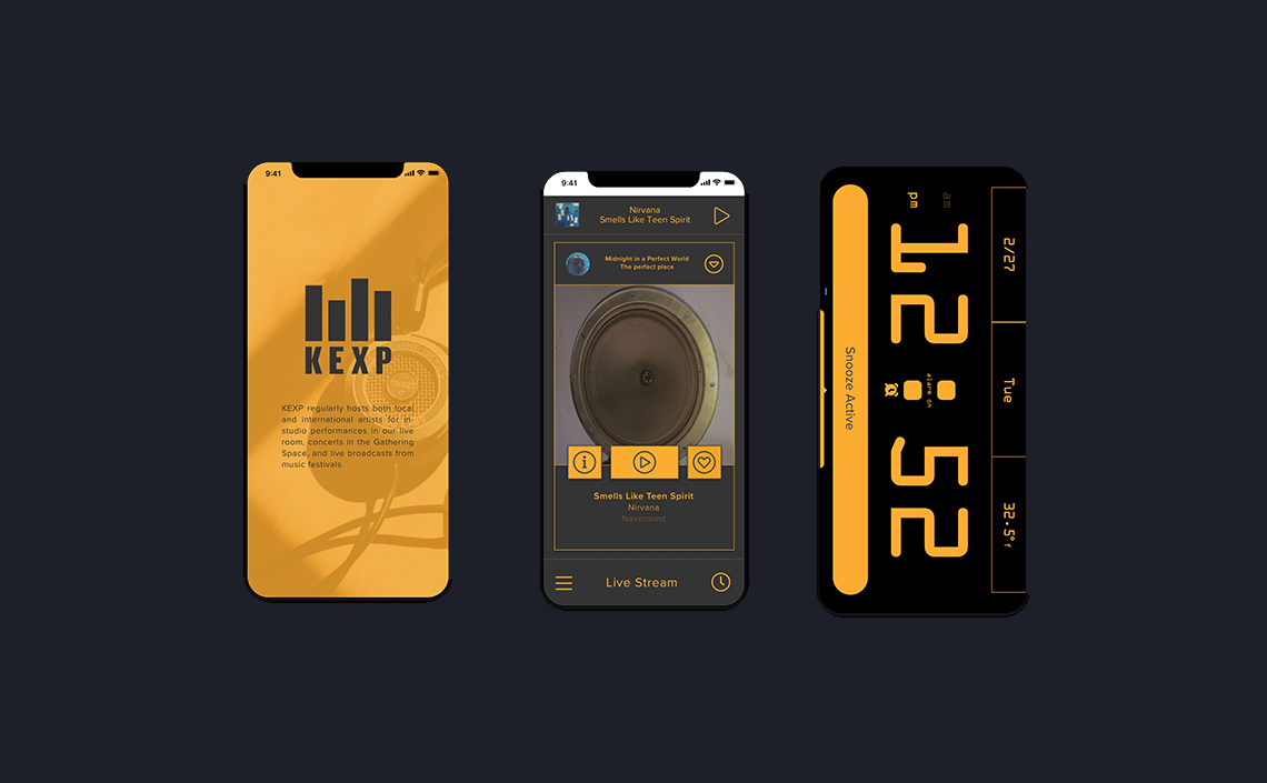
The mobile app in its current form was a very basic limited feature streaming player app. By adding a clock radio feature to the KEXP App, we could combine two things that users depend on their phone for: an alarm clock and streaming music. In turn, we could add functionality to the app that users desired and increase user buy-in and utilization.
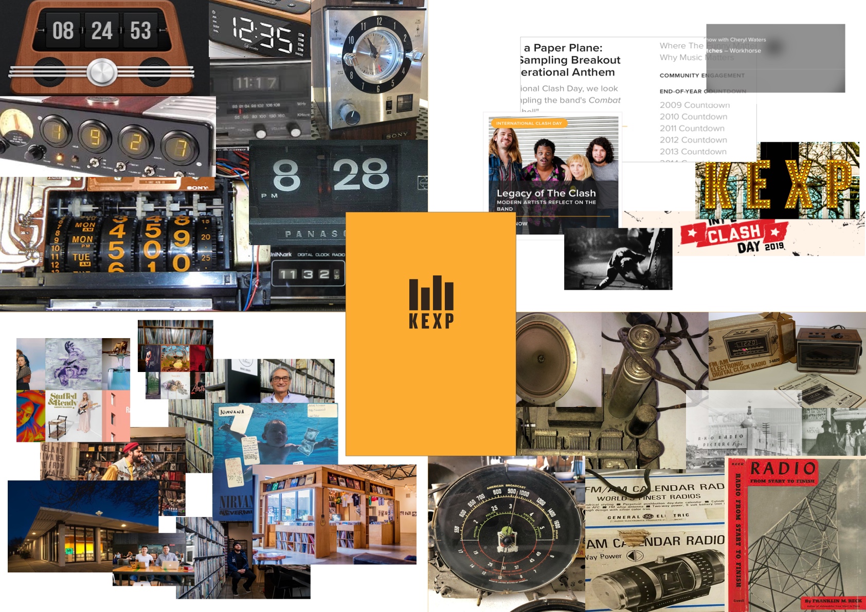
After gathering my research, a mood board was developed and direction determined. The vintage clock was chosen for tapping into the grunge and grit vibe of KEXP. Some vintage radio image was used to update the look and feel of the App to better reflect the existing KEXP website and to further that vintage feel.
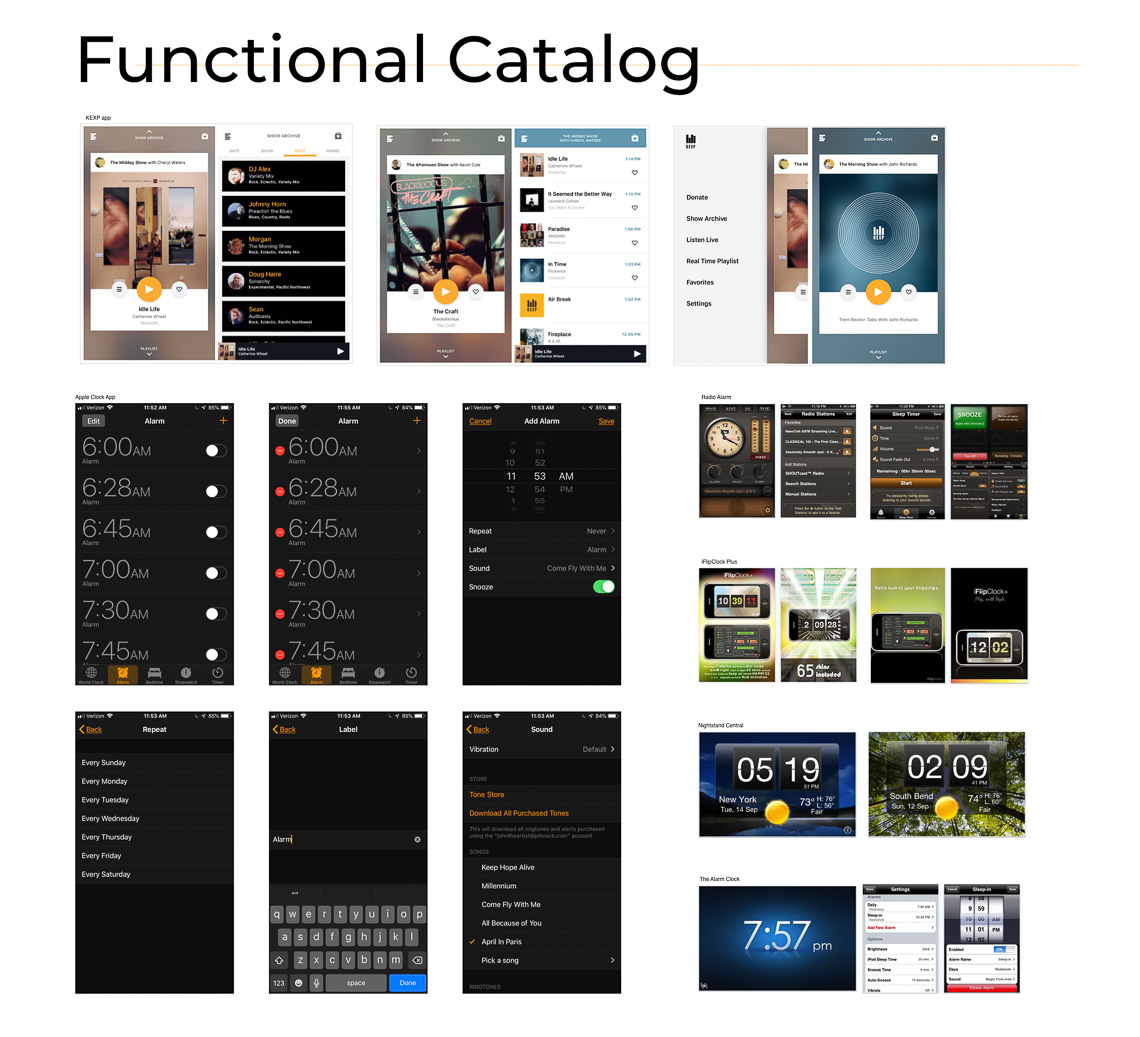
Functional Catalog
To create a functional catalog, additional research was conducted on mobile phone alarm apps, radio alarm clocks. Among others, the Apple Alarm app was used as user flow guide for the KEXP app so it would feel intuitive on the iOS. (For the scope of this project, the Apple iPhone 8 was the deployment device.)
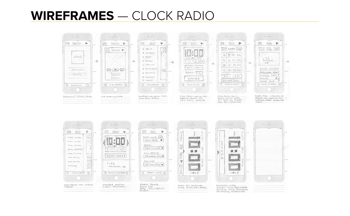
User Flow
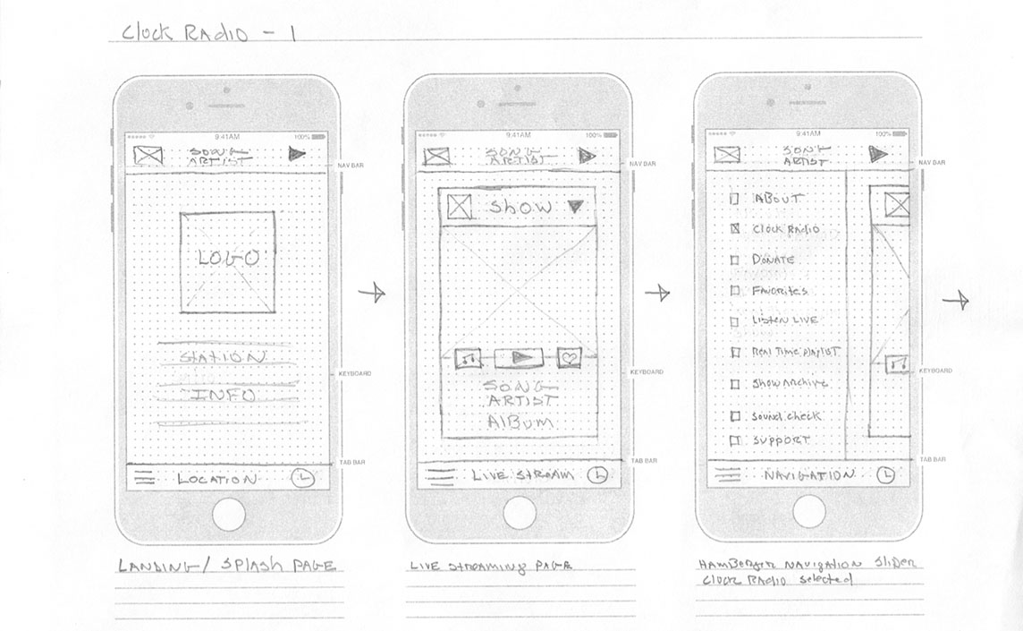
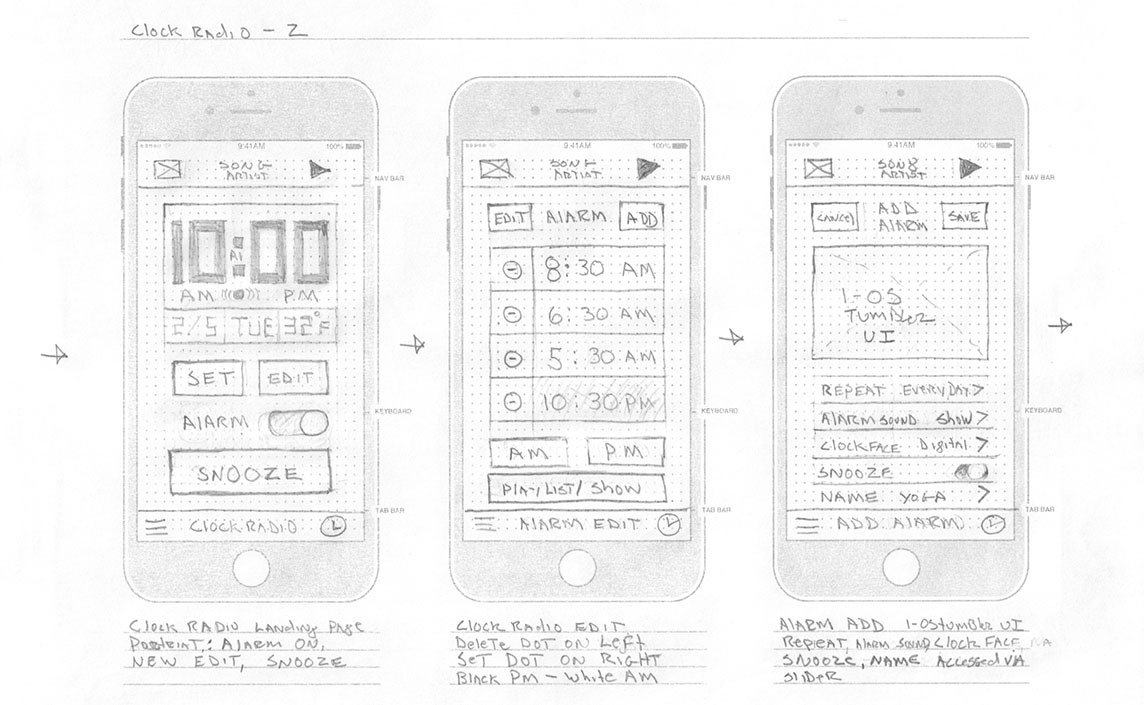
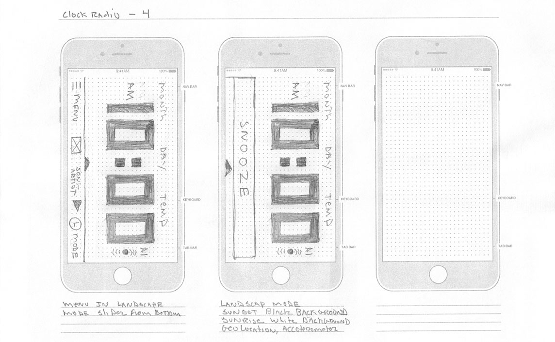
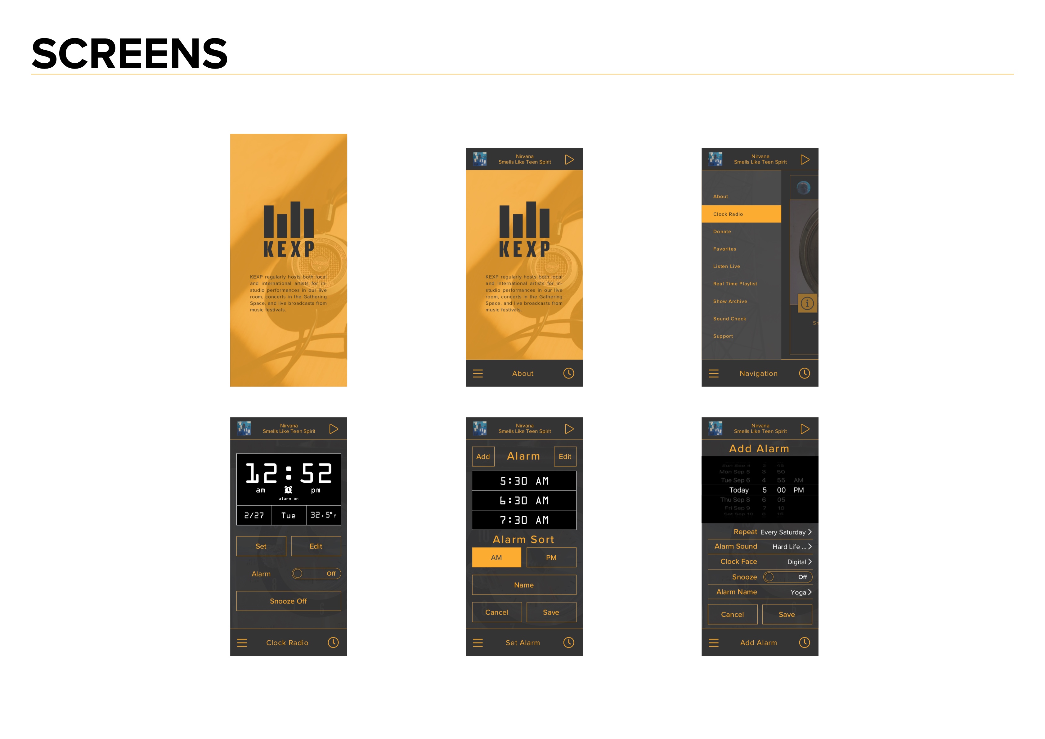
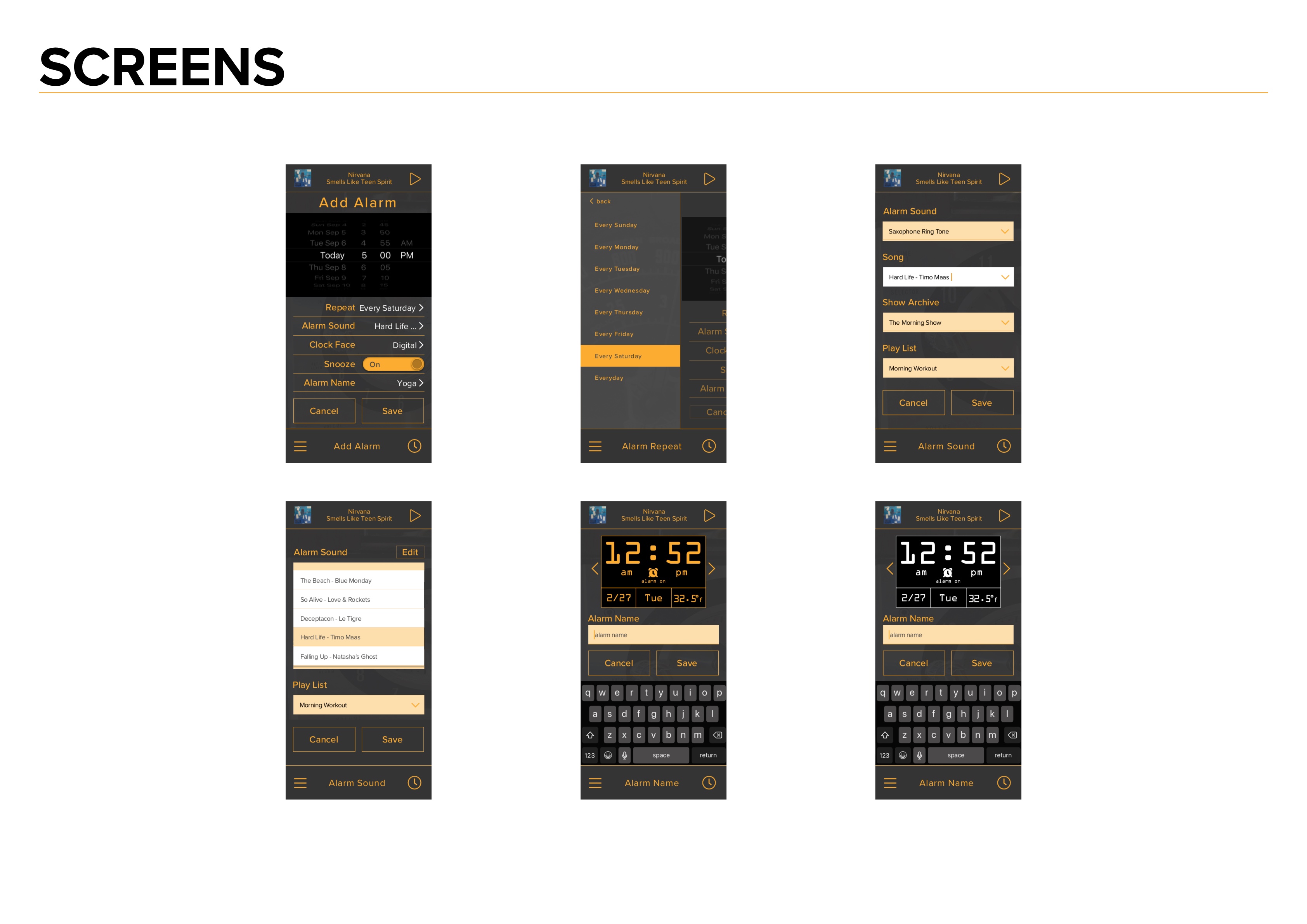
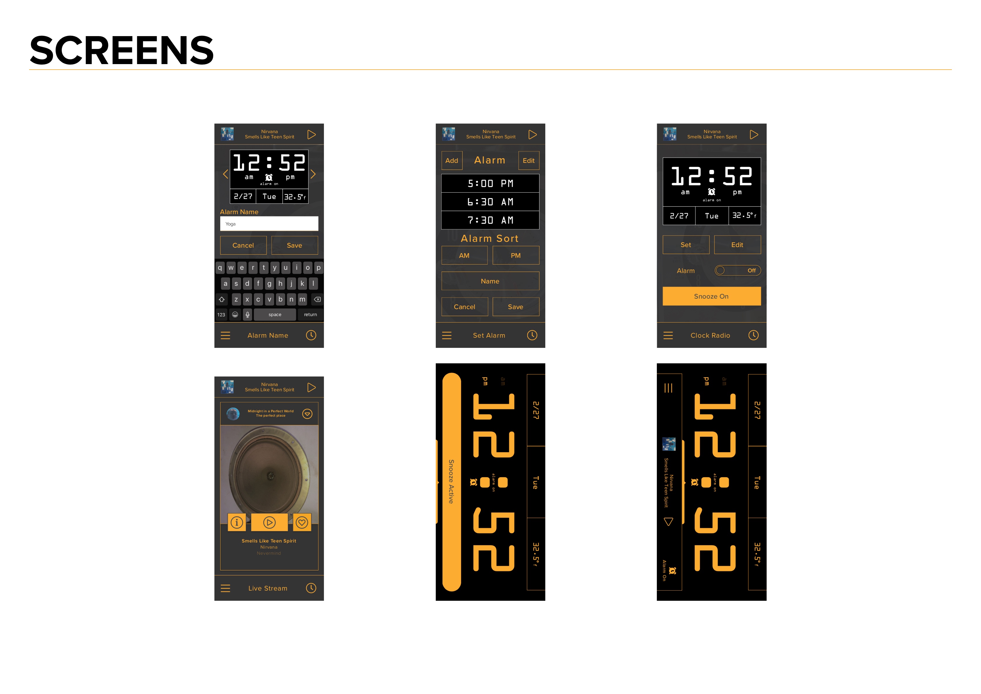
The initial user flow needed further refinement since critical steps were omitted. This was discovered in the process of creating the first set of lo-fi wireframes. Shown below are the first version and final version with final screen designs.
The user flow was refined with paper mockups. It was much easier to visualize the steps involved using paper mockups due to all the setting for the alarm clock. The green circles indicate the hot spots for the prototype. The progression between the two is illustrated in the wireframes section.
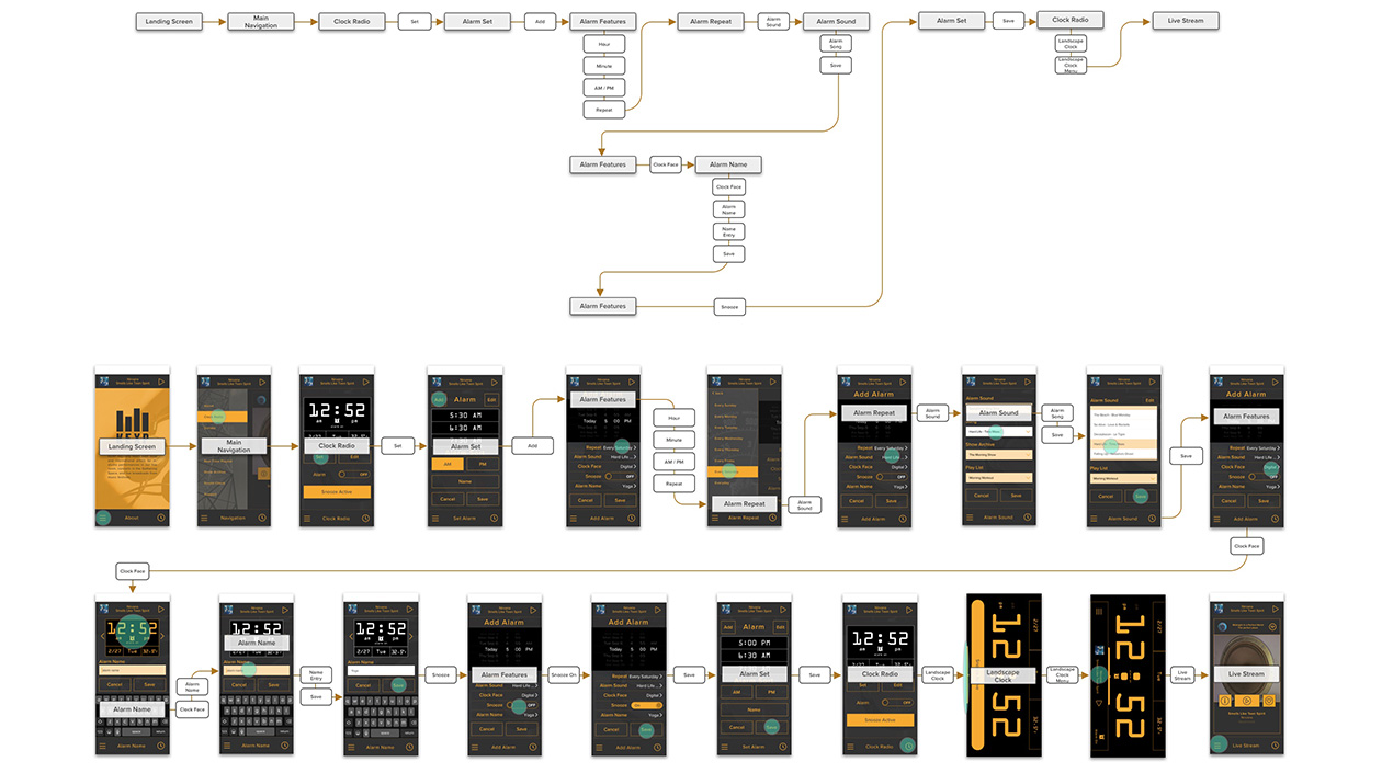
The user flow was refined with paper mockups of rough wireframe screens. It was much easier to visualize the steps involved using paper ""screens" due to all the setting for the alarm clock. This process was repeated several times to refine the design. Once the user flow was completed a final set of pencil sketched wireframes were created.
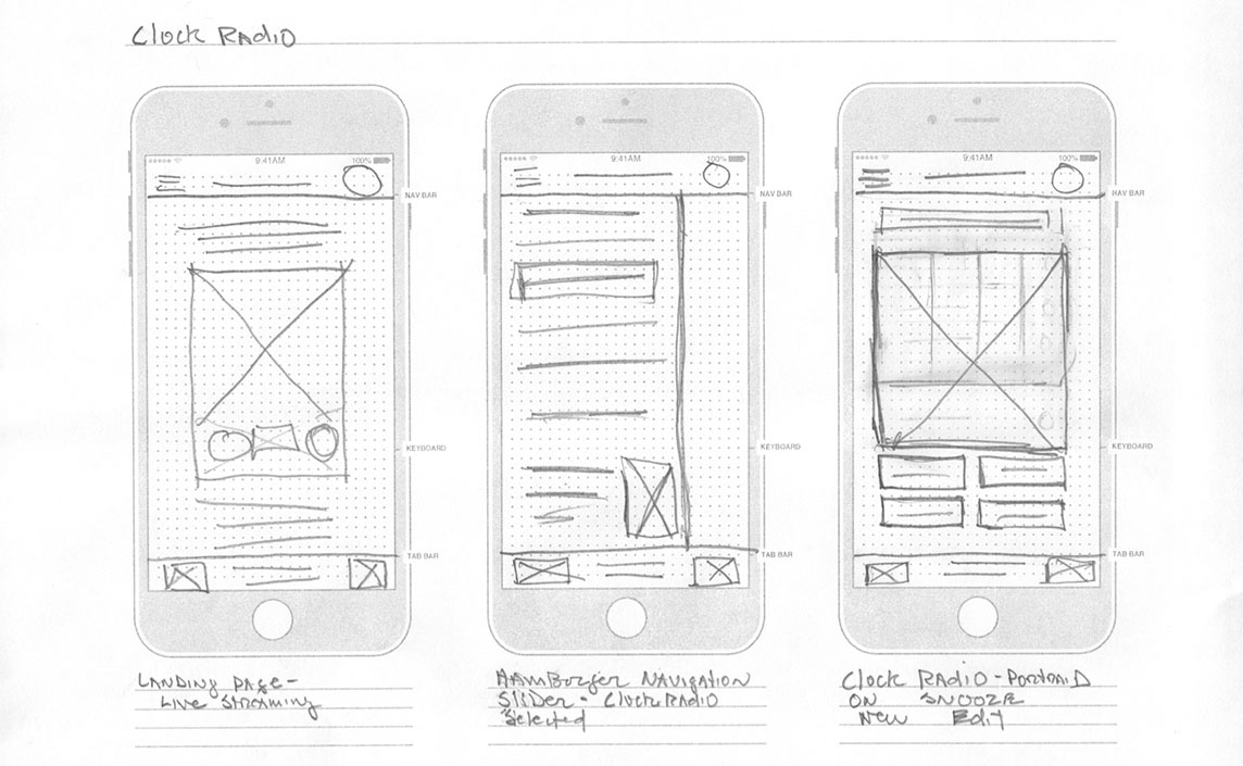
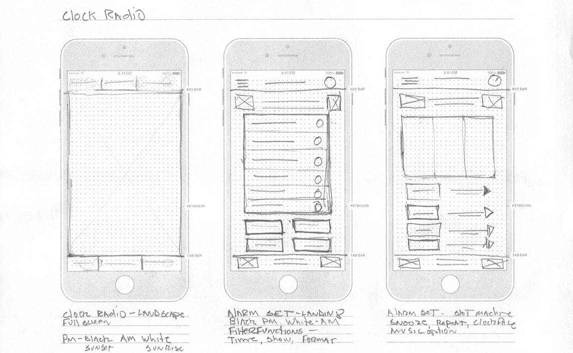
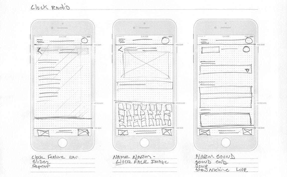
The final sketched wireframes.

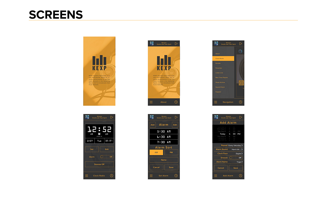
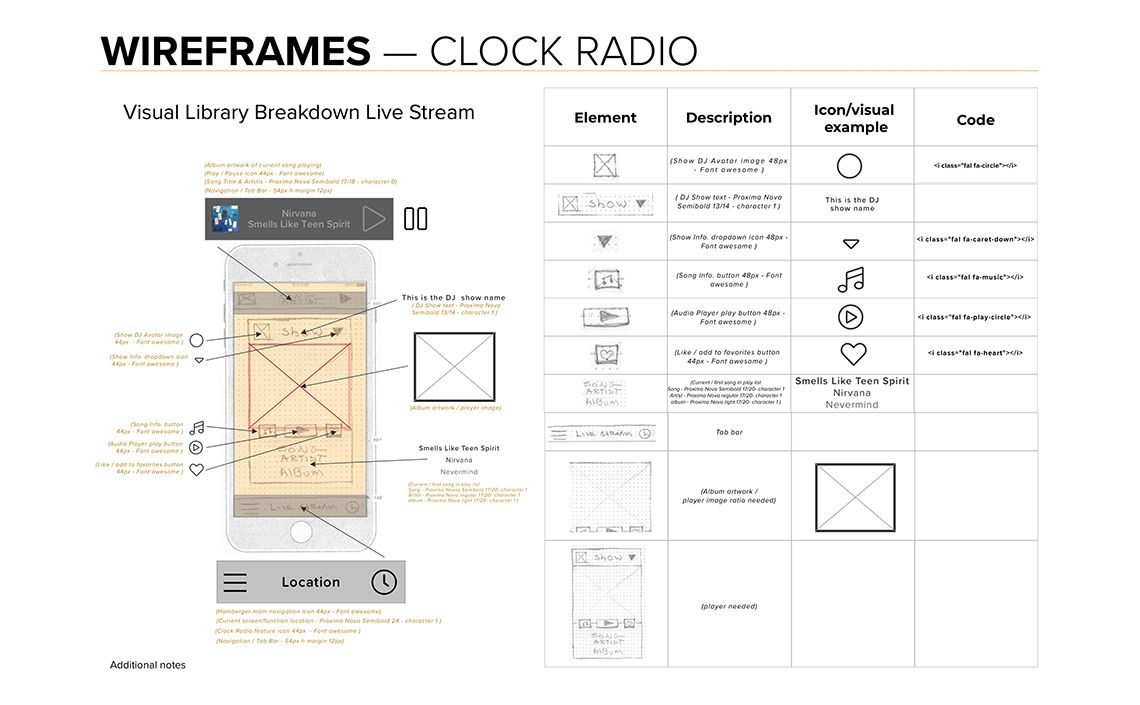
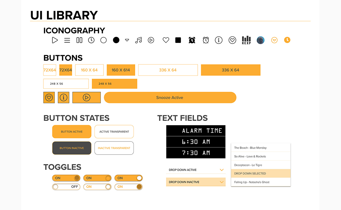
Visual Library Inventory
The sketched wireframes were scanned and a lo-fi visual library inventory was created based on atomic design principles. As the final elements were created, the pencil sketches were replaced with the atomic pieces along with the CSS Code and specs. This was used to create the final atomic design library.
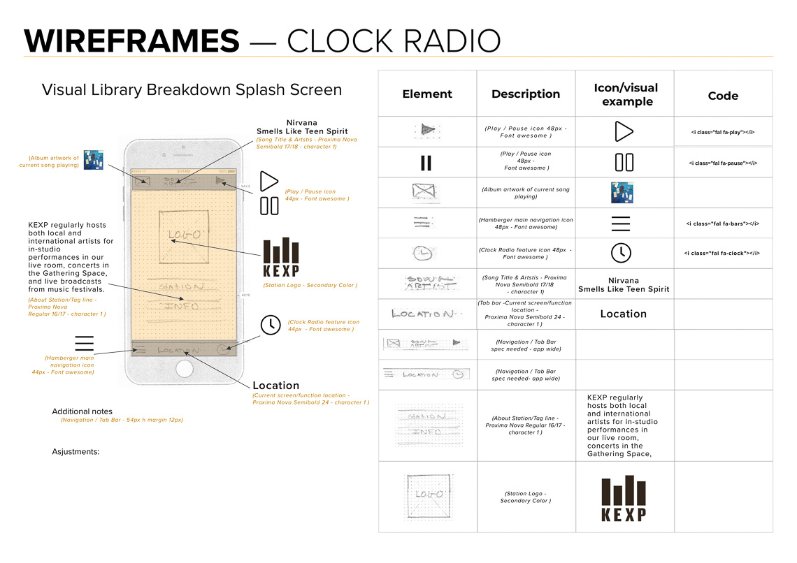
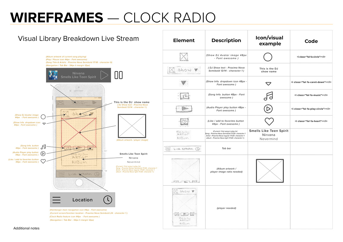
Grid Structure
The app design uses a 4 column grid with increments divisible by 8 or 4. The grid structure was determined by the Add Alarm screens with guidance from the Apple iOS UI guidelines.

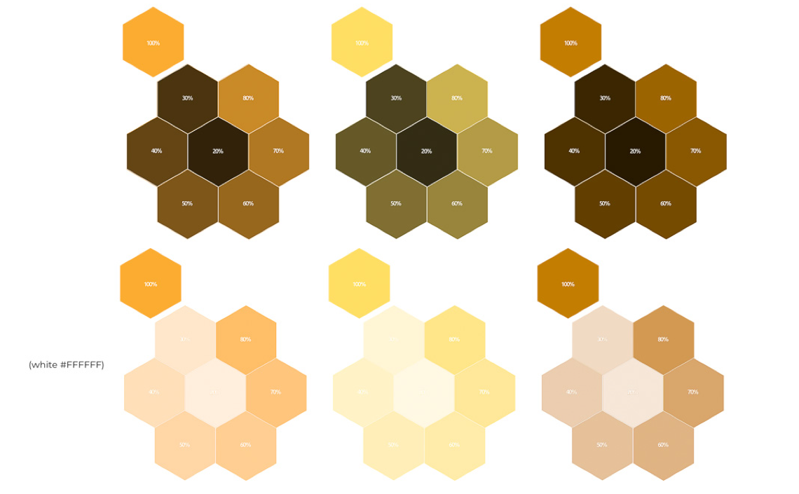
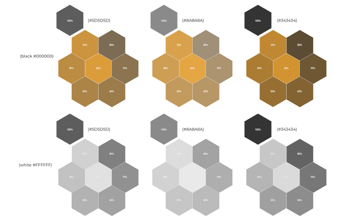
The existing color palette of the KEXP App was redesigned to correspond with the KEXP brand orange and a new color scheme was adopted for the KEXP app.
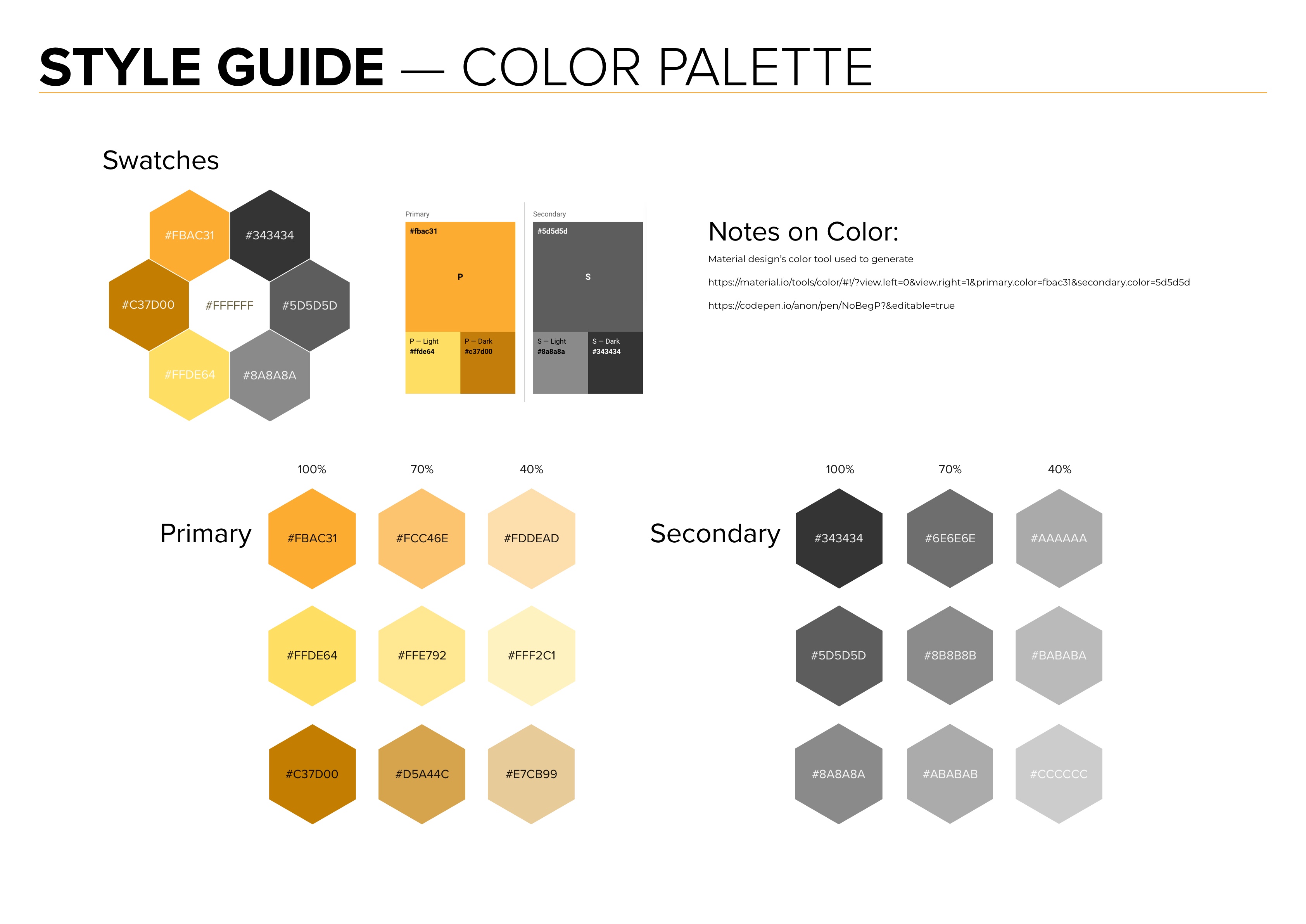
Color combinations were researched, tested for contrast accessibility issues, and chosen accordingly. The research assured that the color palette could accommodate accessibility issues/ Testing was done using Material Design’s Color Tool. The color research was included as a style guide addendum. .
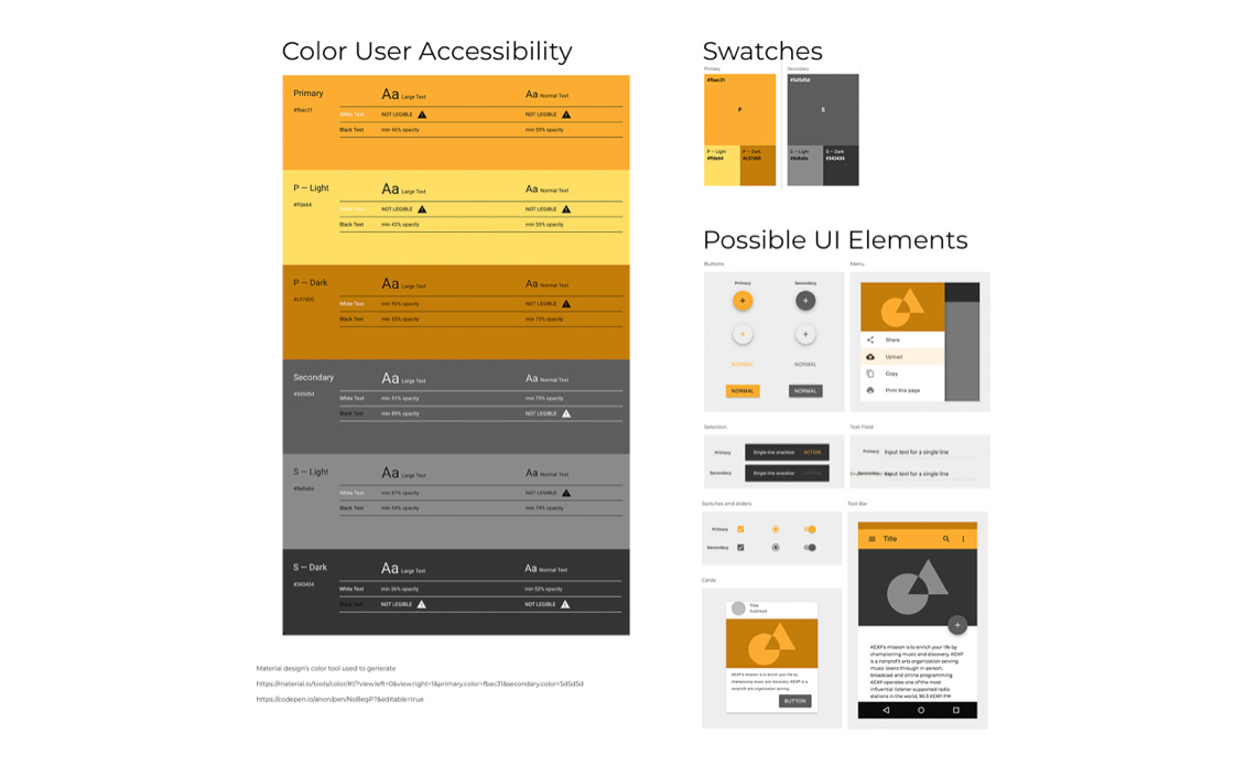

Material design’s color tool used to generate
https://material.io/tools/color/#!/?view.left=0&view.right=1&primary.color=fbac31&secondary.color=5d5d5d
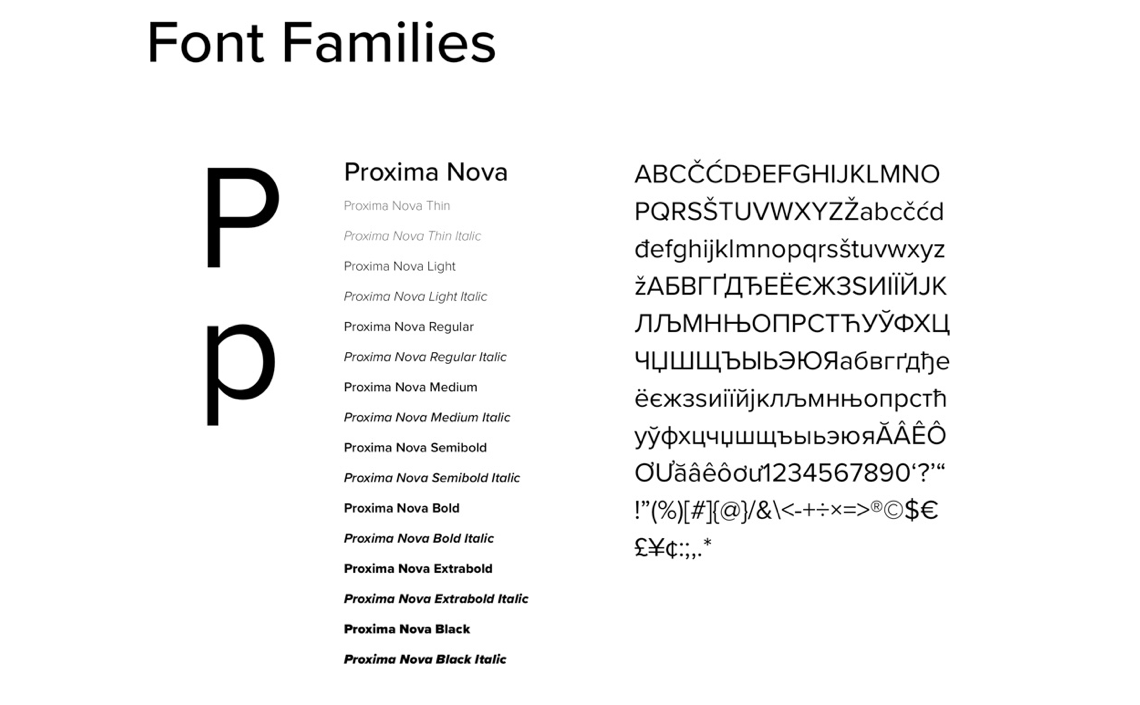
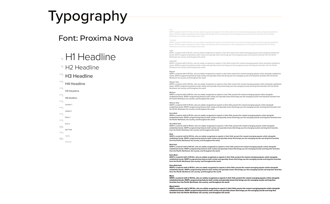
The type ramp was created using Typescale.com and adapted for Proxima Nova.
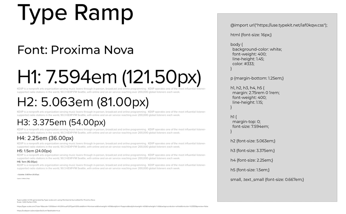
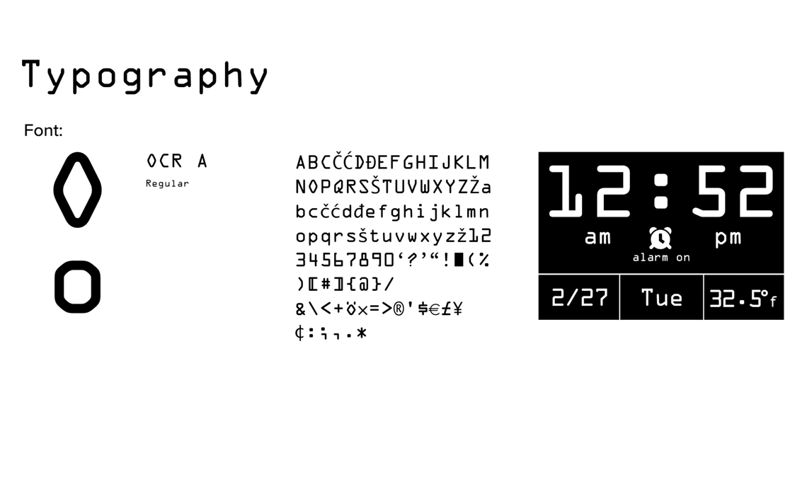
Montserrat was also considered since it was free of licensing concerns but decided to use Proxima Nova as the primary font. Proxima was already in use on the KEXP website and it had a more consistent line weight between font families. OCR A Regular was used for the clock time features for its similarity to the vintage tab drop clocks.
Type Ladder & CSS generated by Type-scale.com using Montserrat but edited for Proxima Nova
Scale: 1.500 Perfect Fifth:
https://type-scale.com/?size=16&scale=1.500&text=A%20Visual%20Type%20Scale&font=Montserrat&fontweight
=400&bodyfont=Montserrat&bodyfontweight=400& lineheight=1.45&backgroundcolor=white&fontcolor=%23333&preview=false
Visual Type Scale CodePen snippet: https://codepen.io/anon/pen/bzJLxm?&editable=truehttps://material.io/tools/color/#!/?view.left=0&view.right=1&primary.color=fbac31&secondary.color=5d5d5d
One of the most challenging aspects of the project is designing things for a small screen. This limitation was liberating since it made me focus on the design elements that were actually needed. Also, found that one to two pixels in line weight makes a huge difference in look and feel on a small screen. When and when not to scroll the screen was also a challenge with this project.
The Takeaway
Project made me realize that I like pencil and paper wireframing as a starting point rather than jumping immediately on the computer. Sketch played a huge role in the project and made me focus digital workflow and the importance of organization / naming structures. Use of sketch symbol libraries allowed for easy updating. Came away project wanting to know more about digital workflows.